HEWI MAG / Design
Bathroom colour concept: For safe and inviting sanitary areas
How does the artful fusion of aesthetics and functionality succeed in the sanitary area? We show you how you can use colours to influence mood and promote a healing environment and orientation.
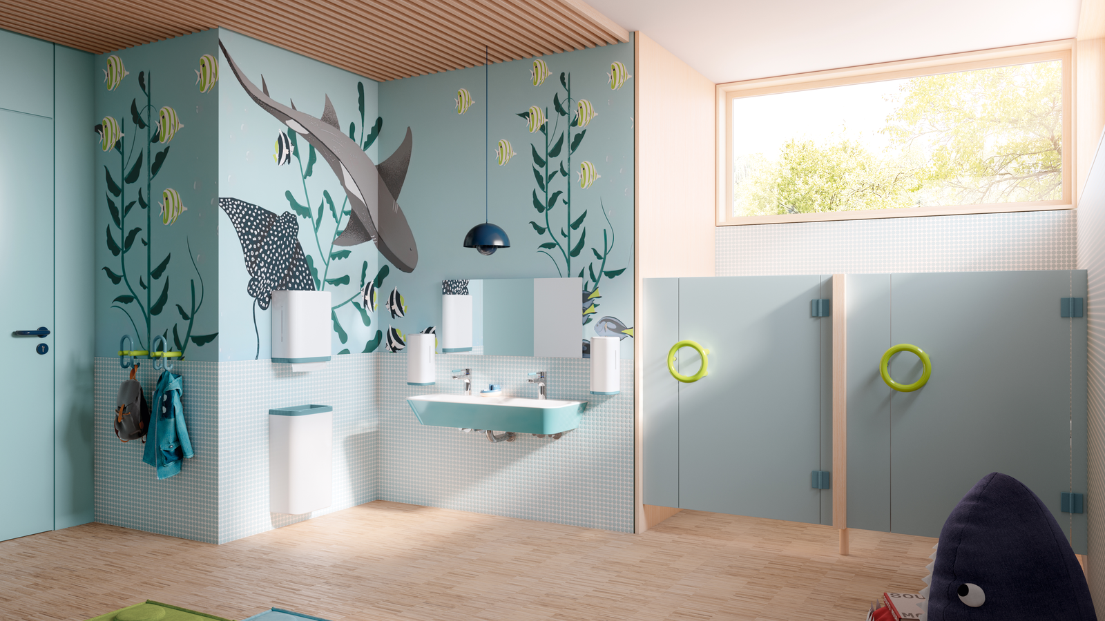
Interior design with colour in the bathroom
Colours have a strong psychological effect on us. Warm colours such as red, orange and yellow can convey energy and warmth, while cool colours such as blue and green have a calming and relaxing effect. In the bathroom, it is important to find the right balance between these colour tones to create a harmonious and pleasant atmosphere. Used in a targeted way, these colours have even more impact.
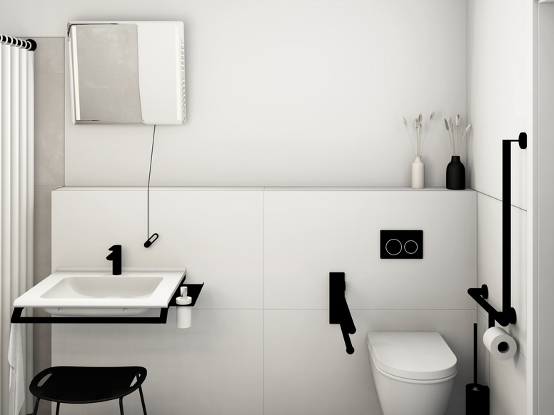
A well thought-out colour concept can help to improve the appearance of a bathroom. Light colours make small bathrooms appear larger and more open, while dark colours can create a luxurious and elegant atmosphere. Choosing the right colours and materials can also help to make the bathroom cleaner and easier to maintain by making it simpler to use. This is particularly important for public or highly frequented sanitary facilities.
Healing architecture: Therapeutic colour concepts for special requirements
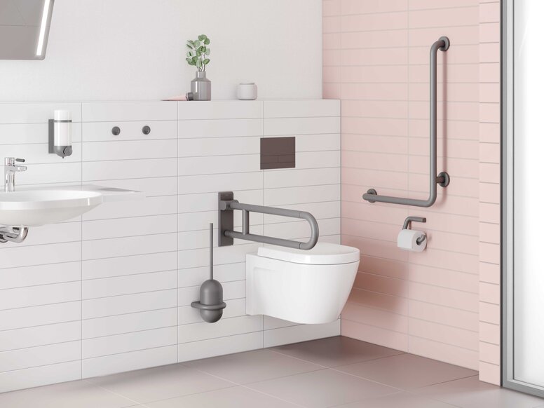
Colours play a particularly important role in the sanitary facilities of hospitals and care facilities for people with dementia and other illnesses. A therapeutic colour concept can make it easier for residents to find their way around and thus improve their well-being. This planning approach is also known as healing architecture . How do colours in the bathroom have a healing effect?
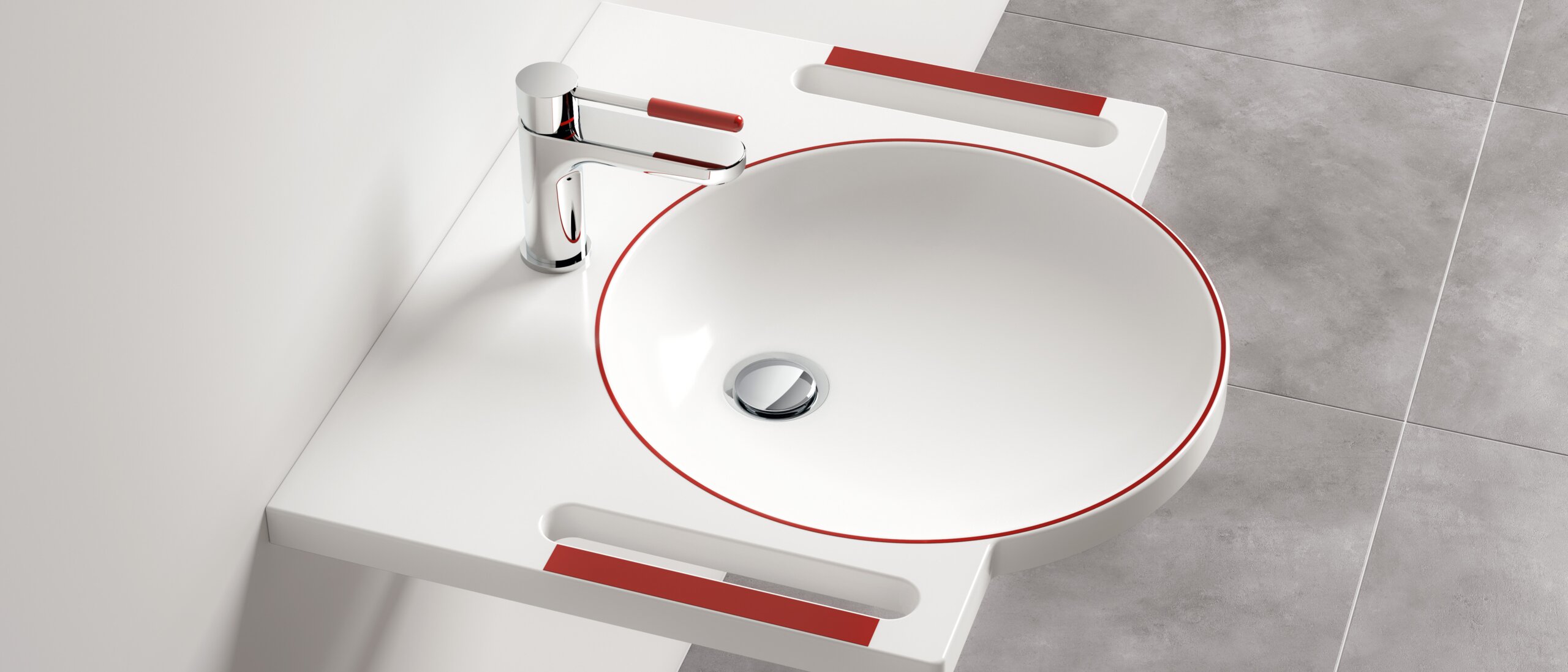
The careful selection of warm and calming shades such as pastel blue, soft green and delicate pink create a relaxing atmosphere and can thus reduce anxiety. Contrasting colours are also of crucial importance: Bright red or vivid yellow are ideal for clearly marking important areas on toilets or support rails, making orientation easier. Such striking colours help residents to better recognise and distinguish the different functions of the sanitary facilities. This in turn promotes their sense of security and independence. Together with the right lighting, including indirect lighting and daylight simulation, therapeutic colour concepts help to create an environment that sustainably improves people's well-being and quality of life.
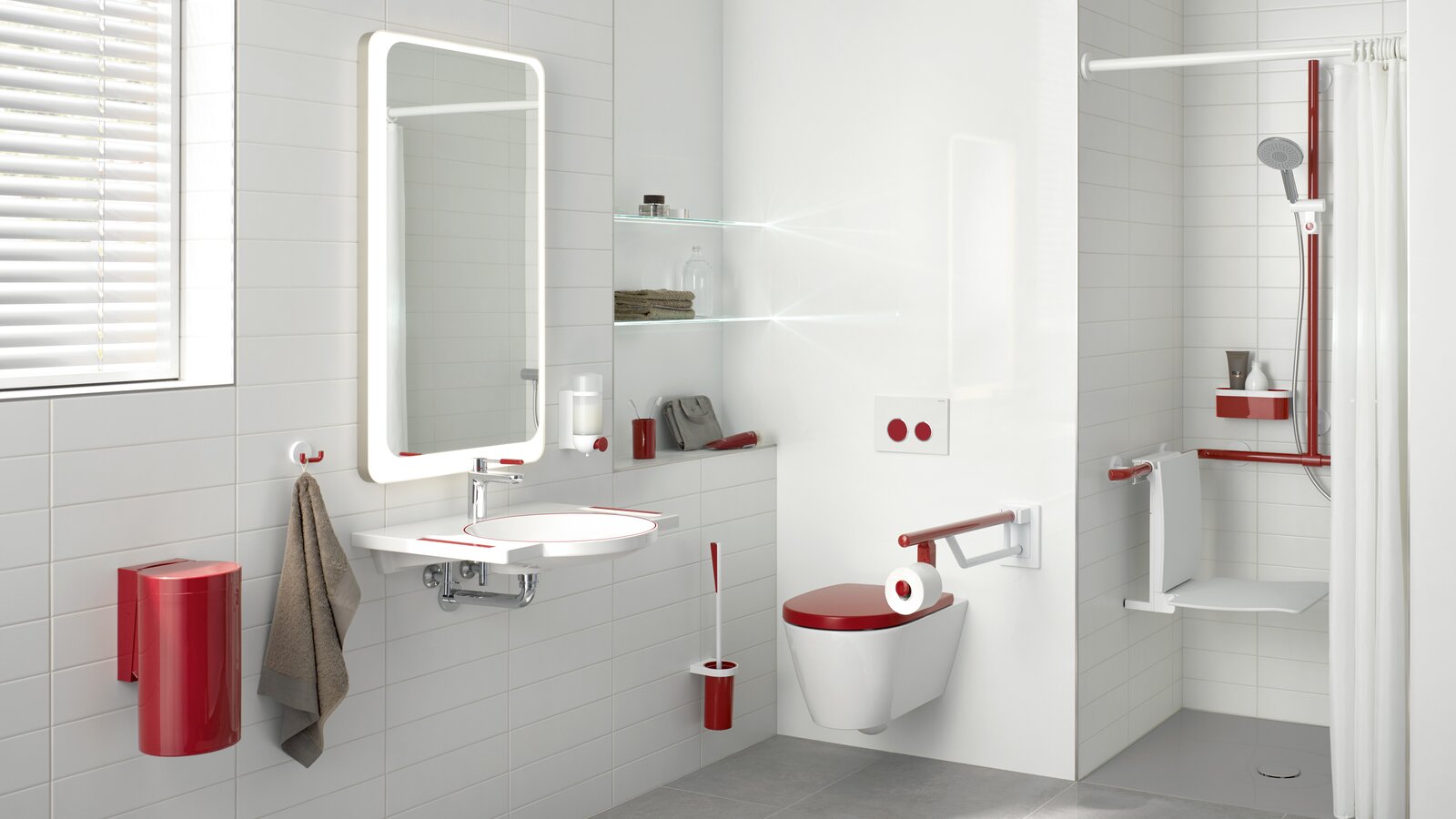
Design in public sanitary facilities
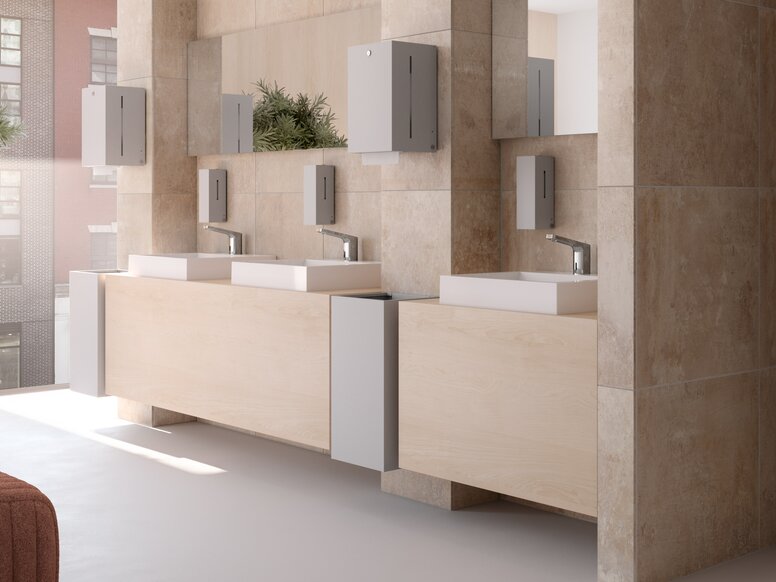
The design of public sanitary facilities is no longer limited to robustness and functionality. Aesthetically pleasing sanitary facilities contribute to the positive appearance of a facility and have a direct influence on the satisfaction and well-being of users.
The targeted design of sanitary facilities in hotels, restaurants, shops and public facilities is increasingly being seen as an opportunity to impress visitors and improve one's own image. In this way, operators send out a positive signal about the quality and service of their facility.
Here too, colour-accentuated WCs, washbasins and support rails identify important areas and functions. This facilitates orientation and increases the safety of the very diverse clientèle, which ranges from the very young to the very old in these facilities – both with and without physical limitations. This not only takes aesthetic aspects into account, but also fulfils practical requirements to ensure optimum use of the sanitary facilities.
Bathroom colour concept: 5 practical tips for implementation
There are a few points to bear in mind when implementing a colour concept in the bathroom. Here are the five most important ones:
- Knowledge of colour psychology: Understand the psychological effects of different colours on users. Also take cultural differences and individual preferences into account.
- Target group orientation: Adapt the colour concept to the needs and preferences of the target group. In a kindergarten , for example, bright, friendly colours can create a positive and inviting atmosphere, while in a care home for dementia patients, white in combination with high-contrast colours can make orientation easier.
- Consideration of the interior design: Think about how colours interact with other design elements such as light, furniture and materials. A well thought-out combination can enhance the desired effect and make the room appear harmonious.
- Practical aspects: Pay attention to the practical applicability of the colour concept. For example, use hard-wearing colours that are easy to clean, especially in high-traffic areas such as washrooms.
- Test and adapt: Carry out tests before the final implementation and make adjustments if necessary. User feedback can provide valuable information for optimising the colour concept and achieving the desired goals.
BE ICONIC. BE COLOURFUL.
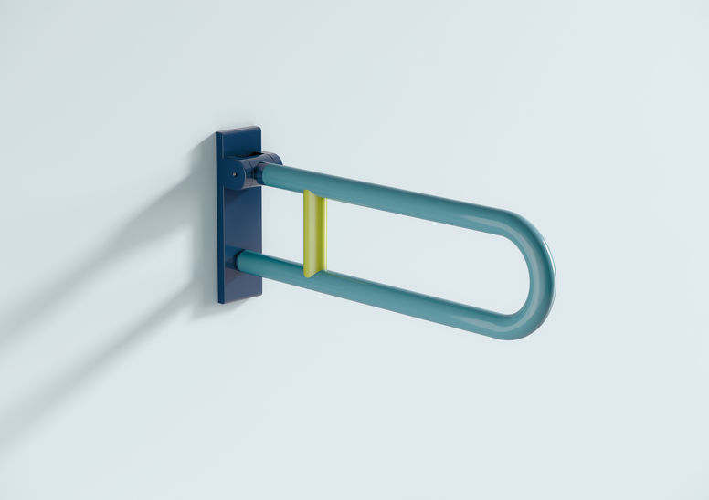
The 477/801 range from HEWI is a design icon for bathroom colour concepts that has been reissued with exciting colour combinations: Be iconic. Be colourful. is the concept behind the 477/801 range and brings emotion and colour into the bathroom. With the targeted use of colour, the newly designed products in the range influence the sense of well-being in a room. In harmony with other colour designs, they promote recovery processes and provide orientation. This creates a relaxing and stress-free environment.
Conclusion
The colour concept in the bathroom has a decisive influence on the atmosphere, orientation and functionality. Colour concepts promote well-being and create a safe environment for people with special needs. We would like to inspire you to transform your customers' bathrooms into an inviting and healing sanctuary with practical tips on realisation and the presentation of an innovative product range. Be iconic, be colourful – and create an environment that evokes emotions.
Stay informed
Do you need help planning a bathroom with a suitable colour concept? We would be happy to provide you with personal advice as a planner or architect.
